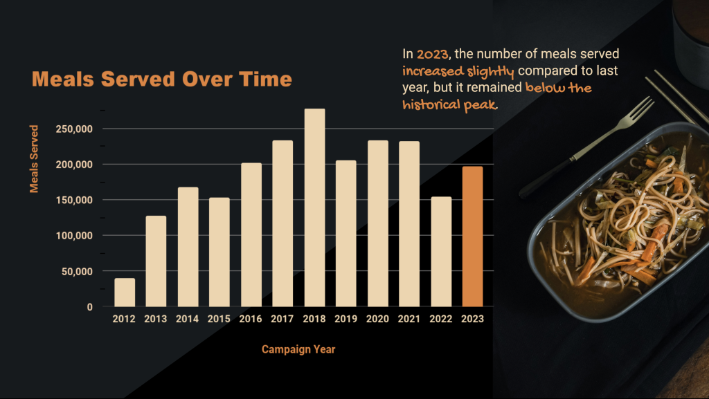
I stumbled upon this noodle image on Unsplash website and decided to incorporate its colors into the graph. To take it a step further, I adjusted the background of the entire slide to complement the image’s background, giving the visualization a bold and eye-catching look.