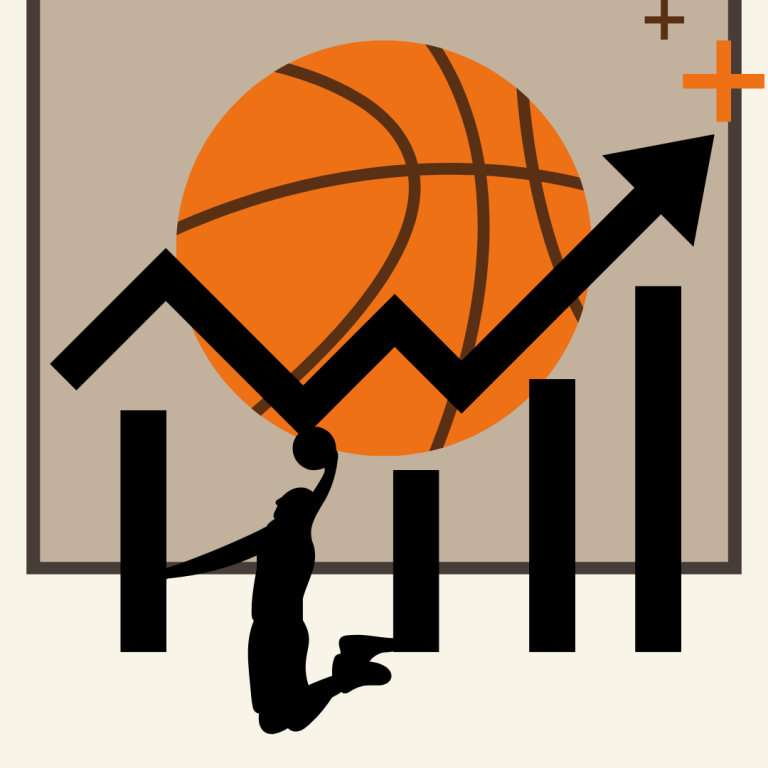
Learning Basketball Through Numbers
Analysis and visualization of NBA player performance metrics for the 2024-2025 season using Tableau.
Analysis and visualization of NBA player performance metrics for the 2024-2025 season using Tableau.

Google Trends data from 2022 to 2025 shows that searches for “yoga” typically peak in January. However, in July 2025, there was an unexpected spike that surpassed the January peak, indicating a surge in interest that goes beyond normal seasonal trends.
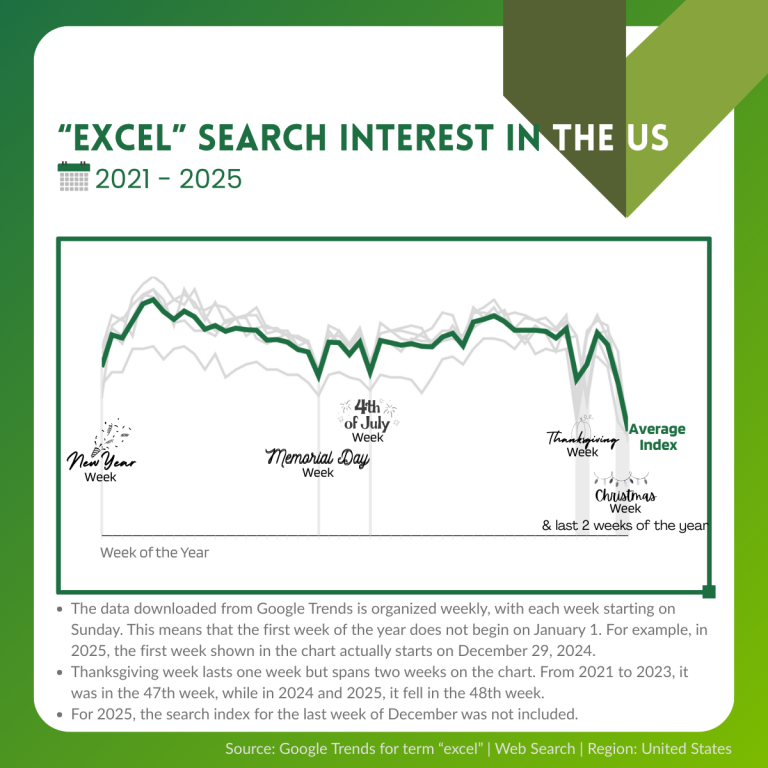
According to Google Trends data for the U.S. region, interest in searching for the term “excel” tends to decrease during major holidays.
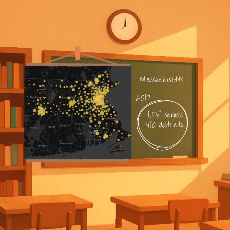
One-page visualization showing the Massachusetts education landscape in 2017 made with Tableau.
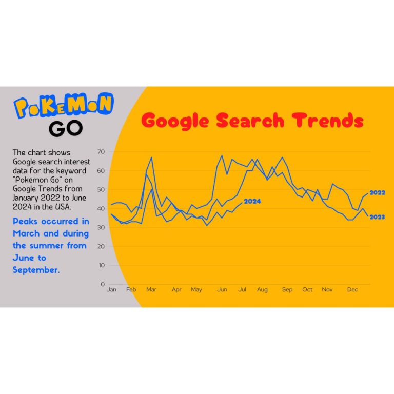
The chart displays the Google search interest data for the keyword “Pokémon Go” as tracked by Google Trends, covering the
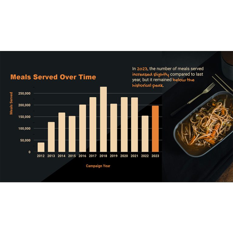
I stumbled upon this noodle image on Unsplash website and decided to incorporate its colors into the graph. To take
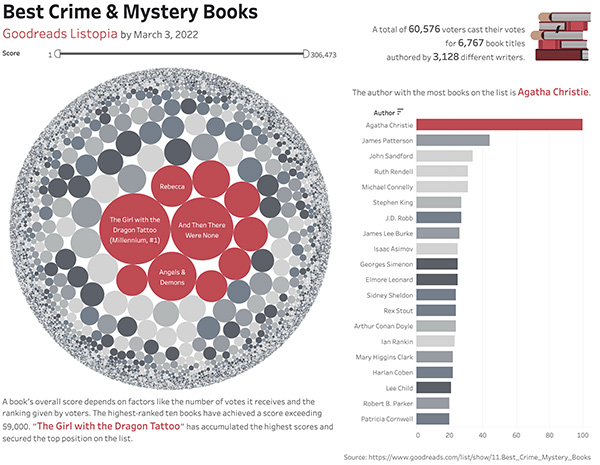
I have visualized a list of books from Goodreads Listopia for your book club members who love a good mystery.
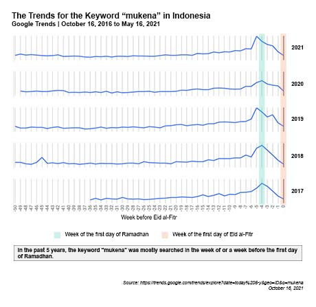
The report on the keyword “mukena” trends in Indonesia over the past five years indicates that “mukena” peaked on Google Search around the beginning of Ramadhan.
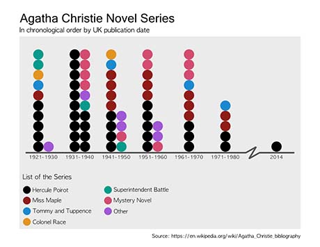
I created this visualization to pay tribute to Agatha Christie, one of my favorite authors.